Blog #7 Cinematography Analysis: Twilight (2008)
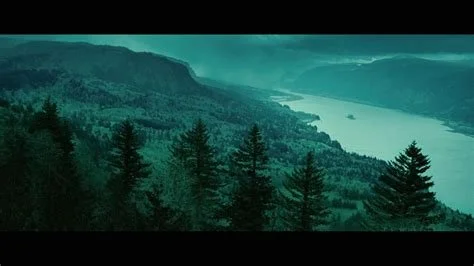
Torquoise and light orange (complementary colours)
I was looking through the top podcasts chart around the world and found that there was a podcast about the Twilight series that was popular. What’s notable about that is the podcast in question hadn’t recorded an episode in the last 3 years. It turns out people still love Twilight in 2025. I’ve been meaning to do a cinematography analysis, so why not base it on a young adult hit like the Twilight (2008) movie? It has a unique, stylised look and is still adored by millions of fans around the world.
Here’s a quick breakdown of the top features of the cinematography in the film, as D.O.P.’ed by Elliot Davis.
Complementary colours. One of the main colours used in Twilight is undoubtedly torquoise. The complementary colour to this would be a light orange, seen in the shot above. I got this information by running torquoise through an online complementary colour generator and found that the corresponding colour to torquoise is a light orange. The consistent use of complementary colours throughout the film indicates a level of planning and expertise in crafting a unique look for the film.

Online complementary colour generator used on Paletton.com
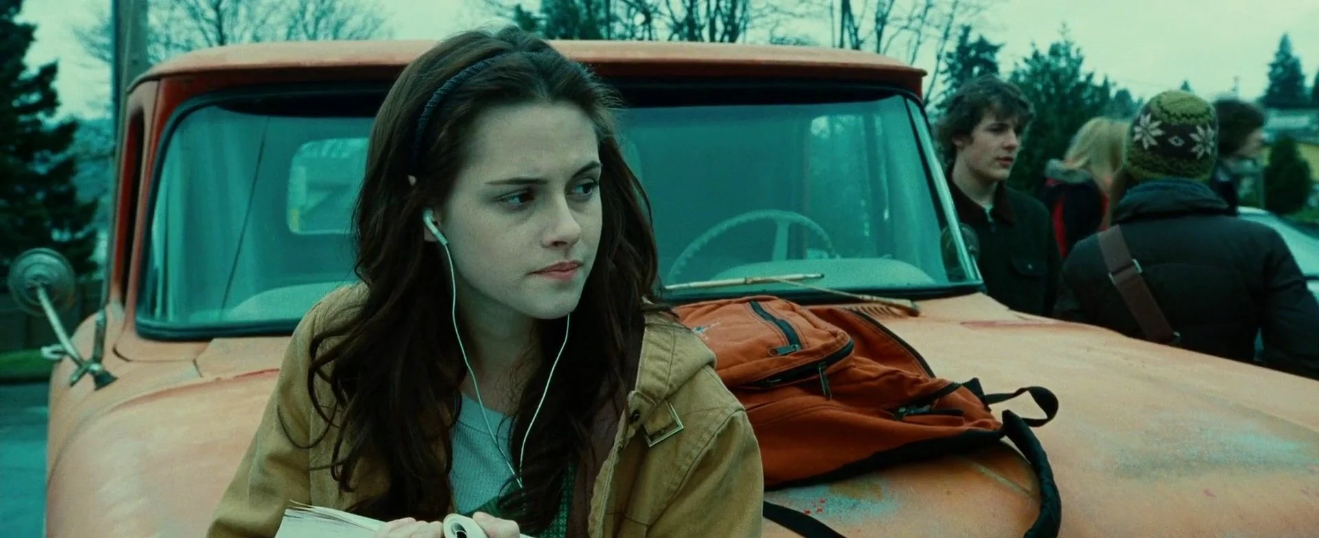
2. The use of turqoise to show off the natural beauty of the woods. The movie was filmed in Kalama, Washington, and Portland, Oregon. In the shot below, you can see woods, which are featured in many scenes throughout the film. The idea to complement the natural colours of the woods with the character’s clothes (Bella above at her truck) is genius. It helps immerse the audience into the world that’s created. The cooler colours help in creating a more somber tone too, with Bella and Edward feeling like abandoned outcasts in their world. Check out the gorgeous colour palette in the shot below.
Unique aqua look
3. Handheld. Some information about the camera setup first: the film was shot on these cameras: ARRIFLEX 435 Camera, Panavision Panaflex Millennium XL Camera and Panavision Panaflex Platinum Camera. It was shot in Super 35 at a resolution of 2048 x 1080 (no 4k in those days!) and distributed at an aspect ratio of 2.35:1.
The decision to go handheld helped create a more emotional connection between the characters of Bella and Edward, creating a kinetic feel to the scenes. But in other scenes, there are dolly tracks that are smooth and dynamic. Some of the dolly shots are circular, adding production value and a wider view of the action. Each decision used helps the story in its own way. This is one more way in which the film shows there was some thought put into the decisions in which the film was made.
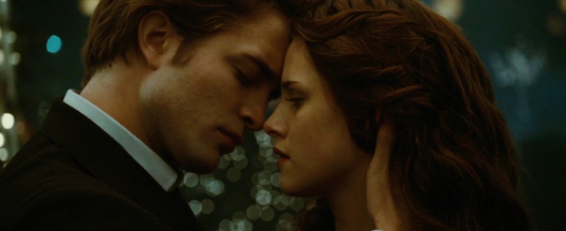
4. Shallow depth of field used in purposeful moments. In the prom scene in the film, there is a romantic dance between Bella and Edward. The two are lit by soft, warm overhead lighting and there are fairy lights in the background. The shallow depth of field creates a gorgeous bokeh from the fairy lights in the background and puts the characters into focus. The scene is warm and intimate. The warm colours on the characters is different from the other scenes, which shows the importance of this scene in the entire plot of the film.
Shallow depth of field
5. Shaping natural light. I found this behind the scenes photo of a shot in the forest:

BTS in the forest
From what I can see, they are using the white panel at a 45 degree angle to diffuse the harsh sunlight on the character laying down. They have another white panel at a right angle to it, which is blocking out any other sun leaking into the shot. There is a large black panel/flag also at 45 degrees to the character, which creates contrast on the figure laying down. The camera is suspended on a large jib and is shooting straight down on his face.
There is a light on and visible (on the far right), being diffused through two frames at a daylight colour temperature. It is providing just a little bit of texture on the right side of the frame to make the shot a little less flat.
This shot looks delicate, with not much space to walk around and C-stands covered in sand bags all over. They brought out the big guns for it. The lighting in the film is subtle and soft, with diffusion frames getting a good workout on set. It suits the story and sucks you in to the movie.
Those are my observations on the Twilight film. I really like the look and thought they crafted the colour, composition and colour temperature coherently throughout the film. Thumbs up to Elliot Davis.
-D.C.